When business owners ask for a “visual identity”, they usually mean a logo. But a logo on its own is like a signature without a personality. A real visual identity is a complete system that makes everything your brand publishes — from an Instagram post to a product package to an invoice — look like it comes from one clearly defined source.
This guide explains the components of a visual identity, how to build one professionally, and what to consider when a brand speaks to a Saudi audience in both Arabic and English.
What is a visual identity?
A visual identity is the set of visual elements and rules that represent a brand and distinguish it from others: the logo, colours, typefaces, imagery, icons, patterns, and the way all of these work together. Its purpose is to help people recognise your brand quickly, associate it with a consistent feeling, and trust it because it looks coherent and organised.
It’s important to separate visual identity from brand in the broader sense. The first is the visible face; the second is the complete impression formed in the customer’s mind through experience, service and reputation. We go into this in visual identity vs. branding.
The components of a complete visual identity
1. The logo and its variations
A professional logo never comes in just one version. You need a primary version, horizontal and stacked versions, a compact mark that works as an app icon and profile picture, and single-colour versions for dark and light backgrounds. Each version has its own uses and rules.
2. Colour palette
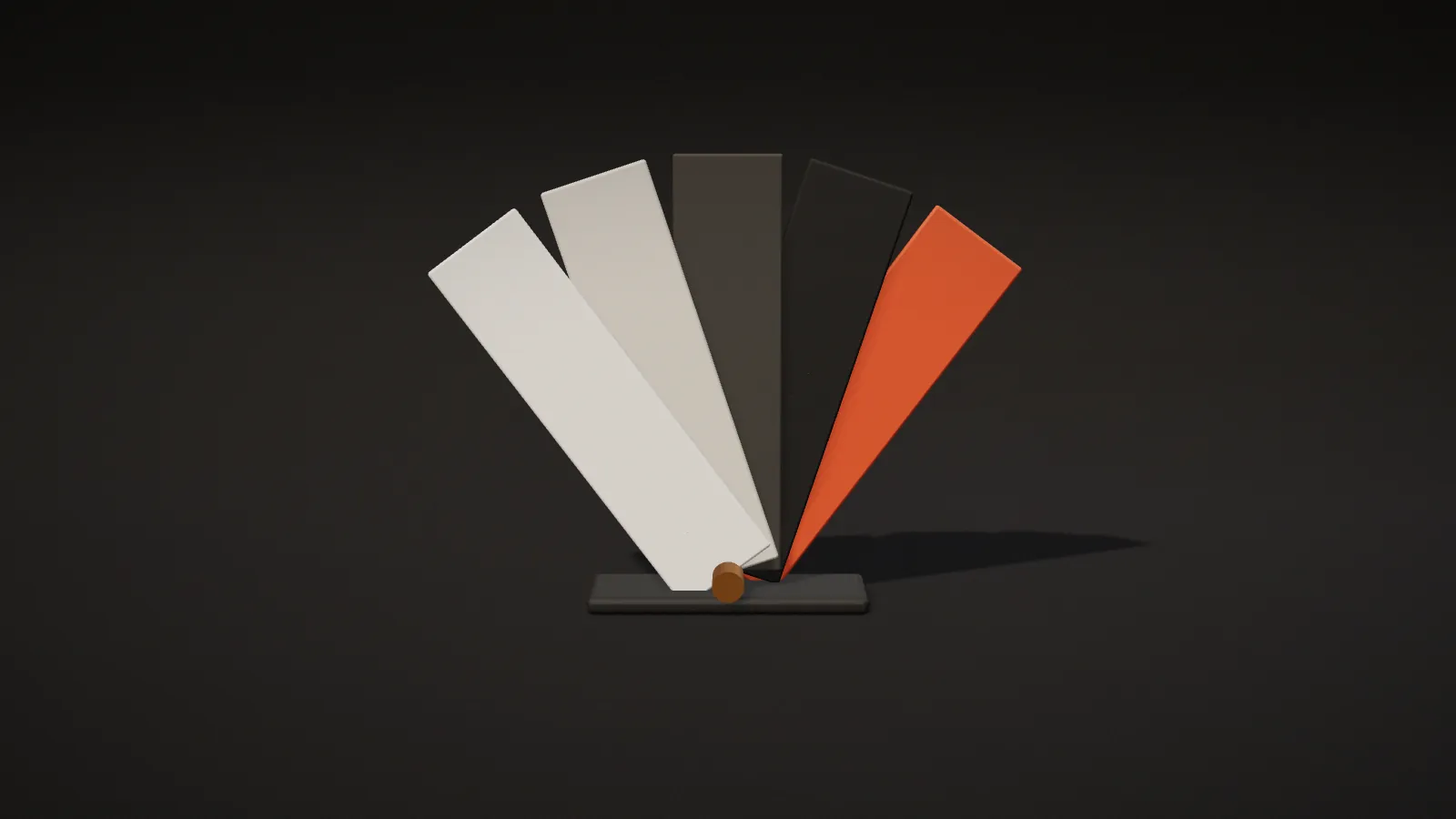
Usually one or two primary colours, supporting colours, and neutrals for text and backgrounds. Every colour needs precise values for every use: HEX and RGB for screens, CMYK and sometimes Pantone for print. Colours that shift between print and ads are one of the fastest ways to weaken an identity.
3. Typography
One typeface for headings and one for body text, with defined weights, sizes and uses. In bilingual identities, the Arabic and Latin typefaces must share the same spirit and weight — not simply be two attractive fonts chosen separately.
4. Photography style
Warm or cool? Natural or studio-lit? Are people shown? Defining a photography style keeps your content consistent even when several photographers are involved.
5. Icons and graphic elements
Patterns, motifs and supporting shapes give an identity flexibility. They’re what make each post look different while still clearly belonging to the same brand.
6. Layouts and grids
Rules for arranging elements in posts, print and presentations: margins, logo placement and the order of information. These rules are the secret to consistency when several designers are involved.
7. Brand guidelines
The reference that brings everything together, with examples of correct and incorrect use. Without guidelines, an identity erodes gradually with every new designer — or every employee who improvises an ad.
How a professional visual identity is designed
- Discovery and research: sessions with the brand owner to understand the vision, audience and values, plus a review of competitors to see what’s overused in the sector and where you can stand out.
- Strategy: defining the brand’s intended personality in clear words (for example, “quietly luxurious” or “bold and youthful”) so it becomes the yardstick for judging designs.
- Initial concepts: presenting two or three genuinely different directions, each with its own logic and story — not three versions of the same idea.
- Development: once a direction is chosen, the logo and visual system are refined and tested on real applications.
- Applications: designing the items you actually need: social templates, print, packaging, stationery and the website.
- Delivery and guidelines: handing over files in every format, the usage guidelines and the source files.
The most important logo test: does it stay clear when shrunk to the size of a profile picture in a mobile app? Many beautiful logos fail this simple test.
What makes a visual identity work in the Saudi market?
Arabic type isn’t a translation of Latin type
When building a bilingual identity, many designers create the logo in Latin first and then “attach” an Arabic version. The result is often a weak or unbalanced Arabic version. It’s better to design both scripts together from the start — or to make Arabic the original if your audience is primarily Saudi.
Reading direction changes the composition
In Arabic content, the eye starts on the right. That affects logo placement, the order of elements, and the direction of arrows and motion in your designs. A well-crafted identity sets clear rules for both directions.
Local culture and symbols
Drawing on local elements — Najdi motifs, architecture, landscape or Arabic calligraphy — can give an identity authenticity and distinction, as long as the reference is considered rather than clichéd, and serves the brand’s personality instead of being extra decoration.
Regulation and registration
Before finalising the name and logo, it’s wise to check the name’s availability and whether the trademark can be registered with the Saudi Authority for Intellectual Property (SAIP), so you don’t build a whole identity on a name you can’t protect.
How to choose your identity’s colours
Colour is one of the decisions most influenced by personal taste — and one of the most important for brand recognition. A few practical principles:
- Start from personality, not your favourite colour: dark, matte tones suggest luxury and calm; saturated colours suggest energy; earthy tones suggest heritage and warmth.
- Look at competitors: if your whole sector is blue, a different colour may be the fastest route to standing out.
- Test contrast: text must be clearly readable on approved backgrounds. That isn’t only aesthetic — it’s an accessibility issue for people with low vision.
- Think about ads: your primary colour will appear in small spaces amid busy content. Will it catch the eye in a crowded feed?
- Plan seasonal colours in advance: how will your identity handle National Day or Ramadan colours without losing its character?
Choosing the right Arabic typeface
An Arabic typeface is as much a technical decision as an aesthetic one. Before committing to a font, check the following:
- Licensing: does the licence allow commercial use on the web, in apps and in print? Many widely shared fonts are free for personal use only.
- Range of weights: you usually need at least one weight for headings and another for body text.
- Legibility at small sizes: some decorative fonts look great in headings but are tiring in paragraphs.
- Support for numerals, diacritics and punctuation: including the numerals you’ll use for prices.
- Harmony with the Latin typeface: in a bilingual identity, both fonts should be close in visual height, weight and spirit.
- Web performance: font file sizes affect site speed, so choose a limited number of weights.
How do you know your visual identity works?
- Distinctiveness: does it look different from your three closest competitors?
- Simplicity: can the logo be described in a single sentence?
- Flexibility: does it work on screen, in print, on fabric and in a small ad?
- Consistency: could a new designer use it correctly with nothing but the guidelines?
- Fit: does it suit your audience and your price point? A luxury identity on an economy product confuses customers — and the reverse is just as true.
Common visual identity mistakes
- Chasing trends: visual trends change quickly, and an identity needs to last for years.
- Too many colours and typefaces: every extra colour or font makes consistency harder.
- Overly fine logo details: they disappear when the logo is shrunk, embroidered or printed cheaply.
- Neglecting the single-colour version: sooner or later you’ll need it for a stamp, an engraving or a coloured background.
- Not receiving source files: so every small edit becomes a new project.
- No guidelines: within months the identity turns into a scattered collection of designs.
When should you refresh your identity?
Not every drop in sales is caused by your identity, but some signs deserve attention: the identity no longer reflects the quality of your current product, it looks dated next to competitors, it doesn’t work well on digital platforms, or your business has expanded into new categories or markets. A refresh doesn’t always mean starting from zero. Sometimes updating the typography and colours and building a clearer system around the existing logo is enough to keep the recognition you’ve already earned.
After delivery: keeping the identity intact
- Share the guidelines with everyone who designs or writes for your brand, internally and externally.
- Prepare ready-made templates for recurring posts, presentations and documents.
- Make one person responsible for checking consistency before anything is published.
- Review the identity every year: what’s working, and what needs adding or simplifying?
To connect your identity to everyday content, see our guide to professional social media design.
Frequently asked questions
What’s the difference between a logo and a visual identity?
The logo is one element of the identity. The identity includes the logo, colours, typefaces, imagery, patterns and the usage rules that ensure the brand appears consistently everywhere.
Should the logo be in both Arabic and English?
It depends on your audience and expansion plans. If you mainly serve the Saudi market but also reach non-Arabic speakers or plan to grow regionally, a balanced bilingual identity is usually the best choice.
Which files should I receive at the end of the project?
Editable source files; the logo in SVG, PDF and transparent PNG in every version; colour values; font files or links to their licences; and the brand guidelines as a PDF.
Can AI design my visual identity?
AI tools are useful for exploring ideas and finding inspiration, but an identity needs strategic decisions, careful letterform development — especially in Arabic — and files that can be registered and used properly. That’s still fundamentally human work.
Conclusion
A successful visual identity is a system, not an image. It starts with understanding the brand and its audience, becomes a clear set of elements and rules, and is preserved in guidelines that keep it alive. In the Saudi market especially, attention to Arabic typography, reading direction and cultural context makes a difference audiences notice immediately.
To build a wider strategy around your identity, read how to build a strong brand in the Saudi market. And if you’re planning a new identity or a refresh, get in touch and we’ll start with a clear discovery session.